If you visit this thread from time to time, any comment about this change, how do you like it?
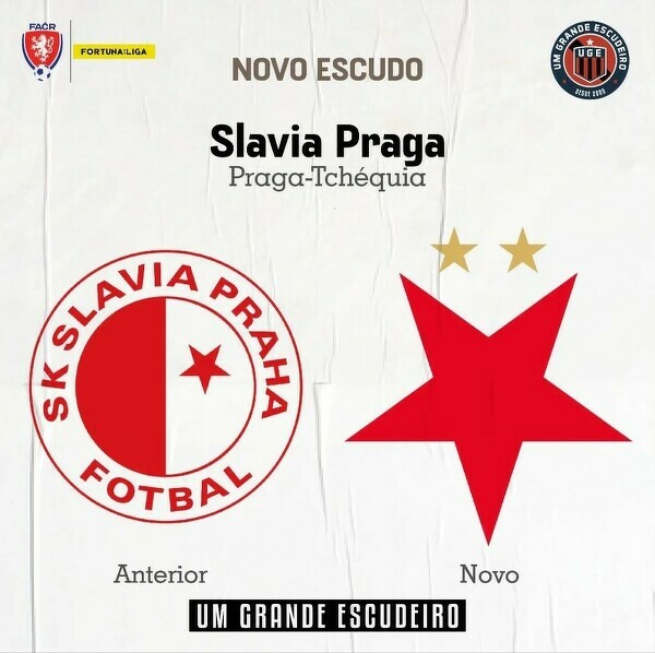
Not bad at all. Slavia also communicated it well, arguing that in the original starting document from 1892, there is a sentence saying "the symbol of the club is a red five-pointed star standing on one of the points, in the white background". So the new logo is in fact a return to origins. Also it is modern and used in the whole graphic concept of the club, the star is the basis of the Slavia font used in all the written materials etc. etc.
I was a bit worried when I learned like 3 weeks ago that Slavia is going to change the logo and the graphic design but this is very good and also it was recieved well among most of the fans.
If you visit this thread from time to time, any comment about this change, how do you like it?
Not bad at all. Slavia also communicated it well, arguing that in the original starting document from 1892, there is a sentence saying "the symbol of the club is a red five-pointed star standing on one of the points, in the white background". So the new logo is in fact a return to origins. Also it is modern and used in the whole graphic concept of the club, the star is the basis of the Slavia font used in all the written materials etc. etc.
I was a bit worried when I learned like 3 weeks ago that Slavia is going to change the logo and the graphic design but this is very good and also it was recieved well among most of the fans.
First of all, most important thing it that you and most of Slavia fans like it.
If I may add my (meaningless) "3 cents" on this: I think that the previous option with "old" club logo and red star on the jerseys was better. Wisła Kraków, whose symbol is white star, uses same scheme as Slavia used to.
Club logo:
Jersey:
Anyway, as I wrote above, if the fans of a club which makes such changes are happy, then everything is fine.
If you visit this thread from time to time, any comment about this change, how do you like it?
Not bad at all. Slavia also communicated it well, arguing that in the original starting document from 1892, there is a sentence saying "the symbol of the club is a red five-pointed star standing on one of the points, in the white background". So the new logo is in fact a return to origins. Also it is modern and used in the whole graphic concept of the club, the star is the basis of the Slavia font used in all the written materials etc. etc.
I was a bit worried when I learned like 3 weeks ago that Slavia is going to change the logo and the graphic design but this is very good and also it was recieved well among most of the fans.
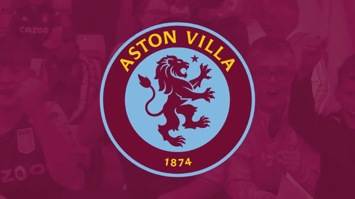
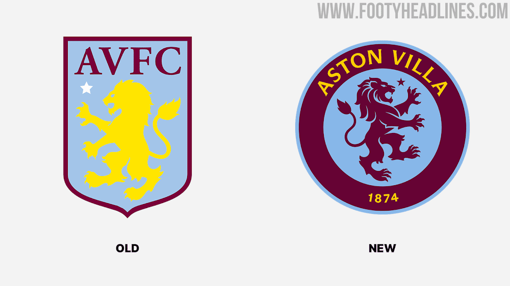
A few words about the similarity between these two club crests. It is not a copy of Chelsea club crest. Aston Villa used a lion in their badge before Chelsea. Just look at the historical crests of both clubs:
Aston Villa
Chelsea
Aston Villa, one of England's most important football clubs and one of the first 12 participants in the English League, was founded in 1874. The lion is a part of Aston Villa's identity ever since club chairman William McGregor took over the reigns in the late 19th century.
McGregor, a Scotsman, had a mutual connection with Aston Villa in the first place because of his Scottish heritage, and decided to work for the club in 1877. In fact, McGregor decided that the lion from Scotland's royal crest should be the emblem of Aston Villa since Aston Villa also had strong ties in the Scottish community in Birmingham.
Furthermore, the round crest pays a homage to their 1982 European Cup triumph.
The first crest, adopted when the club was founded, was the image of a Chelsea Pensioner, the army veterans who reside at the nearby Royal Hospital Chelsea. This contributed to the club's original "pensioner" nickname, and remained for the next half-century, though it never appeared on the shirts.
To someone not familiar with the club history this choice for a "new" Villa logo might seem strange, as the "gas lamp" one seems better designwise than the "Chelsea rip-off", but the fans decision is logical, as the round logo is almost identical to the old one used in the 70s and 80s. That was the golden period of European football for most of the people and the time that logos started being used commercially on a massive scale. I am pretty sure, that most fans would vote for (updated) 70s/80s logos for their clubs if they had such a choice even if they were not really that beautiful, simply because of the emotional ties those logos arouse.
I generally "accept" every change of club logo/crest if it is a result of decision made by the fans of this club, preferably in an open voting. I mean, if they want a change and like a design "A" or "B", then who am I to criticize it?
However, changing a club logo to a simplified one just to earn more money from club merchandise OR against will of the fans or without even asking them about opinion is a different story.
Whatever the reason is, we can always discuss about aesthetics of new logo, if we like it or not, if the previous one looked better or worse etc. I don't see anything wrong with that.